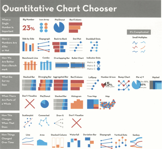
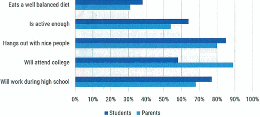
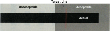
What We LikedThis book is well written on quality glossy paper suited to the frequent colorful display of detailed graphics that are required to illustrate the accompanying text. Each page has wide outer margins to its texts, useful for the reader to add marginal notes and, with the increased white space, makes what turns out to be a complex in-depth subject, into comfortable reading. Moreover, the author has a friendly style of writing that makes it easier to digest what is really an abstract topic. Figure 2 shows the Quantitative Chart Chooser on the Book's inside cover that was mentioned in the previous section. This is a really valuable reference for all project managers needing to report project progress of one sort or another to upper management — and everyone else for that matter. Data illustrated by an appropriate graphic is much more likely to be digested and retained by the recipient, than several unread paragraphs. The trick is to represent the data with the right graphic and the relevant focus. For those who cannot wait, yes, there is also a Qualitative Chart Chooser on the inside of the back cover. The graphical display of this type of non-numerical data[11] is described, explained and recommended in Chapter 8: When the Words Have the Meaning.[12] Incidentally, this new or heavily revised chapter is the longest chapter in the whole book. It is well worth reading because, at the very least, it will help you to distinguish between the good, bad, and terrible ads-on-TV for example, and why. By the way, you can download an updated sample data set from this book's associated website: stephanieevergreen.com/books so you can build your own amazing visuals.[13] Figure 2: Quantitative Chart ChooserWhy we visualizeTo ask this question is almost to suggest that "There are none so blind as those unwilling to see", but the intent here is to enable our audience to see better. It is easy to product graphics with software. It is more difficult to produce good graphics, and challenging to produce effective graphics. Stephanie displays a chart showing data that you could be proud of, see Figure 3.[14] Figure 3: Parent vs. Student PerspectivesHowever, if your intent is to show particularly that only 58% of students expect to attend college compared to their parents that score 89%, then your chart has missed the point completely. And that's the point — keep asking that question: "What am I really trying to say, what is my point?". As Stephanie says: "If you don't have a point, you probably shouldn't bother graphing the data."[15] Bullet graphsAs another useful example, you have probably seen a Bullet Graph before, although the name requires some degree of imagination. Stephanie's example is shown in Figure 4.[16] Figure 4: The Bullet Graph showing several key design elementsThis is a very simple device that conveys four aspects of a single measurement, which is obviously more informative than a single reading. This is done by of capturing and using the reading's background. Here's what Stephanie has to say:[17]
"A bullet Chart encodes your actual data as a bar (usually black), plotted with a target line (usually red) against grey ranges of performance, like unacceptable/acceptable or poor/satisfactory/good. You don't usually see a single bullet graph isolated like this. More commonly, they are packed into data dashboards where each variable has its own bullet graph, all arranged on one sheet of paper."
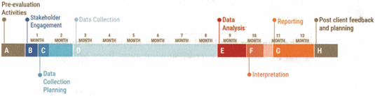
Just imagine how powerful that can be when reporting progress of a project, or a particularly significant project activity, by presenting it against the relevant schedule or cost! TimelinePossibly, one of the most important dimensions for the project manager is time, simply because time is inflexible, and it is what you do with it that counts. It is not uncommon for plans and proposals to be presented along with lists of performance target dates, such as "We'll start now, and get this done by (soon), then we'll do this by (date), followed by (another date) and get done by (target end date)." Whether listed horizontally or vertically, the result is not very attractive and unlikely to register with most people, being displaced by "Ah well. It'll be when it be." By comparison, plotting the timeline proportionally is much more persuasive, because it forces the reader to peer into the future, see Figure 5.[18] Figure 5: Timeline for key activities laid out proportionatelyHere, Stephanie cautions that if such a chart is used to accompany some form of presentation or in a lengthy text or discussion, parts of the timeline should be exhibited as the presentation progresses. It is too much to expect your audience to retain all that information in only one showing.
11. That is, Qualitative Data. Qualitative Data can be defined as non-numerical data that approximates and characterizes and can be observed and recorded. It can be arranged categorically, based on the attributes and properties of a thing or phenomenon. It is most marked in opinion surveys.
12. Effective Data Visualization, Chapter 8, p207.
13.Ibid, p xv.
14. Ibid, p3.
15. Ibid, p5.
16. Ibid, p105.
17. Ibid.
18. Ibid, p224.
|