IntroductionAs a child, I was always fascinated by numbers — how many of this, how many of that. Like how many ants are there in an anthill based on a sample area? And how many know how to all stream in the same direction? Or how many bugs must bump into one another when flying at high speed round a light bulb at night, especially in the tropics? Or how many nuts and bolts of my beloved Meccano set that now seem to be missing? Or how many steps will it take today to walk round the block that I have chosen for my daily exercise, how long did it take today compared to previous days, and am I getting better or worse?[1] Even today, I have difficulty in not counting, I often have to tell my self to "Stop counting!" When our babies came along, they were carefully weighed and the results plotted on a graph and, of course the second was compared to the first. In later years, a regular plot of the annual rate of inflation[2] compared to my yearly income growth was carefully followed. Indeed, for several of the early years, if my income-adjusted-for-inflation fell below "the horizontal"[3] I would actively seek redress from my manager. I remember one particular response: "It's the same for all of us!" In short order, I moved on. Plotting the data so that others could share it was a whole new challenge — especially in my early working life. At one of my first assignments to a large construction job, I still recall seeing a rough progress chart showing the rate of buildup of how many man-hours were being spent day-by-day. And while the progress tended to be somewhat erratic, I marveled at the idea[4] but questioned whether that was what we really wanted to know — and what else could be plotted and how. Today, to see data plotted in some graphical form is quite common, often with some artistic embellishment — I suppose to make the picture "interesting" to attract attention. Equally often we see two or more sets of data on the same presentation but plotted to two different sets of scales and, worse yet, only parts of the scales displayed at different spreads. In the end, all you get is the concept of lines wiggling around.[5] In pursuit of this interest, I have three marvelous books by Edward R. Tufte. The first is The Visual Display of Quantitative Information published in 1983. Tufte's illustrations were mostly pictures of numbers, how to depict data with columns and bars, but often shown with some artistic form or background. For example, one such clever depiction conveyed the annual life cycle of the Japanese beetle both monthly, size, and location above a below ground, see Figure 1.[6] Figure 1: The Life Cycle of the Japanese BeetleTufte's second book, Envisioning Information, was published in 1991. In his Introduction he says: "Revealed here are design strategies for enhancing the dimensionality and density of portrayals of information — techniques exemplified in maps, the manuscripts of Galileo, timetables, notation describing movements, aerial photographs, the Vietnam Veterans Memorial, electrocardiograms, drawings of Calder and Klee, computer visualizations, and a textbook of Euclid's geometry."
As you may imagine, the book does take some time to digest and, interestingly, repeats the graphic shown in our Figure 1. Tufte's third book is Visual Explanations, published in 1997. The contents are clarified by the subtitle: "Images and Quantities, Evidence and Narrative." As Tufte explains in his Introduction:[7] "This book describes design strategies — the proper arrangement of space and time of images, words, and numbers — for presenting information about motion, process, mechanism, cause and effect. These strategies are found again and again in portrayals of explanations, quite independent of the particular substantive content or technology of display."
Generally, I found Tufte's third book difficult to follow as it really consists of six different essays, each of which go into exasperating detail. Still, it is all good background as we move into the digital age. So, now we have author Stephanie D.H. Evergreen's new book Effective Data Visualization: The Right Chart for the Right Data shows readers how to create charts and graphs that meaningfully display their creators' data findings to best advantage.[8] Welcome to the computer age of Data Visualization. About the authorDr. Stephanie Evergreen is an internationally-recognized data visualization and design expert. She has trained future data nerds worldwide through keynote presentations and workshops, for clients including Facebook, Mastercard, Adobe, Verizon, Rockefeller Foundation, Brookings Institute, and the United Nations. She writes a popular blog on data presentation at StephanieEvergreen.com. Her two books on designing high-impact graphs, slideshows, and reports both hit #1 on Amazon bestseller lists weeks before they were even released. This past Spring Dr. Evergreen published the second edition of one of those bestsellers and a brand new sketchbook with templates for making infographics and dashboards.
1. At age 93, that number is becoming a serious issue.
2. In the UK..
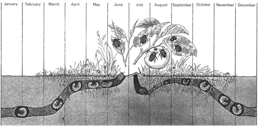
3. In other words, my purchasing power was falling in spite of modest increases in pay, and not rising in spite of my increasing experience.
4. It was quite unique at the time.
5. Newspapers seem to be particularly fond of this.
6. The Life Cycle of the Japanese Beetle, The Visual Display of Quantitative Information, E.R. Tufte, Graphics Press, Cheshire, Connecticut, US, 1983, p43
7. Visual Explanations of Quantitative Information, E.R. Tufte, Graphics Press, Cheshire, Connecticut, US, 1997, p9
8. Stephanie uses Excel software to demonstrate her ideas. The level of skill required is described variously as "Ninja Level: #" where "#" represents a level of skill from 1 (low) to 10 (high). "Ninja" is really a fancy descriptor adopted from the Japanese characters "nin" and "ja" meaning to move stealthily. Ninjas originated in the mountains of Japan over 800 years ago, but the label was only recently introduced into the English language around 1964 implying some special skills — merriam-webster.com/dictionary/ninja#h1
|