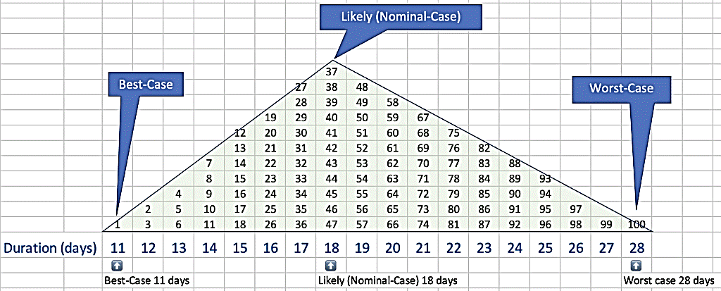
Take a Closer Look Let's start by looking at an individual task. Imagine your estimator told you that fastest (best-case) that a task could be done in was 11 days, likely duration was 18 days, worst-case was 28 days. I've graphed the task duration on the X‑axis below. Then I superimposed a triangle to represent the probability of any specific outcome on the Y‑axis. You can see that the best and worst-case outcomes are not very likely, but they are possible. The nominal-case is the most likely outcome. Inside the triangle, I've put the numbers 1 to 100 to help visualize. We could simulate the duration of this task by generating a random number between 1 and 100 and looking up the corresponding duration (click image to enlarge). If you are a nerd like me, you could open Excel right now and enter the formula =randbetween(1,100) Then copy and paste it a dozen times to generate hypothetical durations for this task. The number generated isn't the duration, but if you look your answer up on the triangle, you will find a corresponding duration at the bottom. Hit recalculate a few times and you should see that most of the answers are near the likely case, with some outliers.
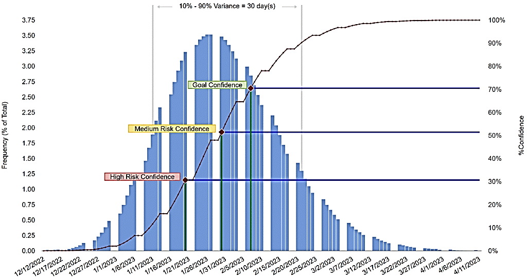
Now imagine all project tasks in a network. Using a simulation, we could "do" the project by telling the computer when the project started and having the computer randomly generate an "actual" duration for each task from the estimates. The result would be a date and time of project completion after we accumulated all the durations. Now imagine we ran that simulation 10,000 times, generating different random numbers each time. The output would be 10,000 end dates, which we could graph to show a more nuanced prediction of how long the project will take. This is called a "Monte Carlo Simulation". There are several tools that can provide a version of the graph shown below (click to enlarge).
The X‑axis here shows the completion dates. The right Y‑axis shows the frequency of the given end dates from the simulation data. The left Y‑axis shows the cumulative probability distribution — a fancy way to answer the question, "How likely is it that the project finishes on or before the given date?" This corresponds to the red hill climber that starts at zero on the left side of the figure and climbs to 100 by the time it gets to the right.
|